Calisthenics at Thomas Duncan Gallery
Rachel Elizabeth Jones writes about Matt Paweski's show "Calisthenics" at Thomas Duncan's space on Melrose.
By Rachel Elizabeth JonesOctober 17, 2015
The following is a feature article from the summer issue of the Los Angeles Review of Books: Magazine. Click here to get your subscription today.
All photographs courtesy of Thomas Duncan Gallery. All rights reserved.
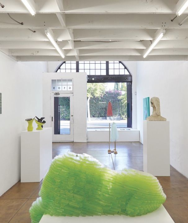
THE HUMAN BODY, with only minimal room for argument, is not capable of inventing muscles. Strengthening, yes, obsessing over, certainly — flexing, bulging, showing, tearing, toning — but creating brand new ones is still out of range. Fortunately, though, we are creatures of absurdity, and if we only have so much control over literal muscles, there is endless room to make, and exercise, figurative ones. It’s in this territory that “Calisthenics” erects its arena in miniature. A collection of 14 works by 12 artists curated by Matt Paweski at Thomas Duncan’s modest, two-storied space on Melrose. The show is far-reaching, bringing together a broad range of work from artists who are not united by any glaring type of proximity. In this way, the exhibition starts to come together as a play, or meditation, on the notion of figure and “figurative” itself — a gentle puzzle about body parts, movement, and studio practice.
¤
Linda Stark’s Fixed Wave is maybe the most raucously carnal of the works. It is positioned to meet the viewer head-on when, after entering, she makes that slow, casual left pivot to begin her cycle. Completed in 2011, LA based Stark is known for her process of dripping, layering, and carving oil paint for a thick and weighty outcome that emphasizes the strength of her already strong pop visuals, which usually illustrate themes of feminism and spirituality. Three feet by three feet and hung at eye level, Fixed Wave is a big and bold rendering of female genitalia — that is, labia majora, uterus, fallopian tubes with fimbria, and ovaries. Blue waves that crest in cartoonlike fashion obscure the uterus at the top of the mons Venus. The grooves of the anonymous woman’s body are decidedly topographical, and Stark’s color choices and use of undulation evoke a relatively soothing female biology filled with water and strong magic. It is with a touch of faith and mystery that the silver drops drip neatly from a source far removed from the figure’s womb, a hypothesis that involves (but does not necessarily require) female genitalia in the processes of female power. At the risk of sounding too flippant, Fixed Wave is highly Instagram-able and it is worth noting that it, and its sibling works, were made prior to the app’s hegemony of the square. And, at risk of sounding too fangirl, Fixed Wave is like the coolest babysitter you ever had (the one with blue toenail polish) — majored in Studio Art and Gender Studies before becoming a radical biology textbook illustrator. Or, perhaps she became the branding agent and logo designer for a futuristic, female-centered start-up given that Stark’s sense of geometry invokes the visual power of corporate monolith, despite her presumably anti-patriarchal stance.
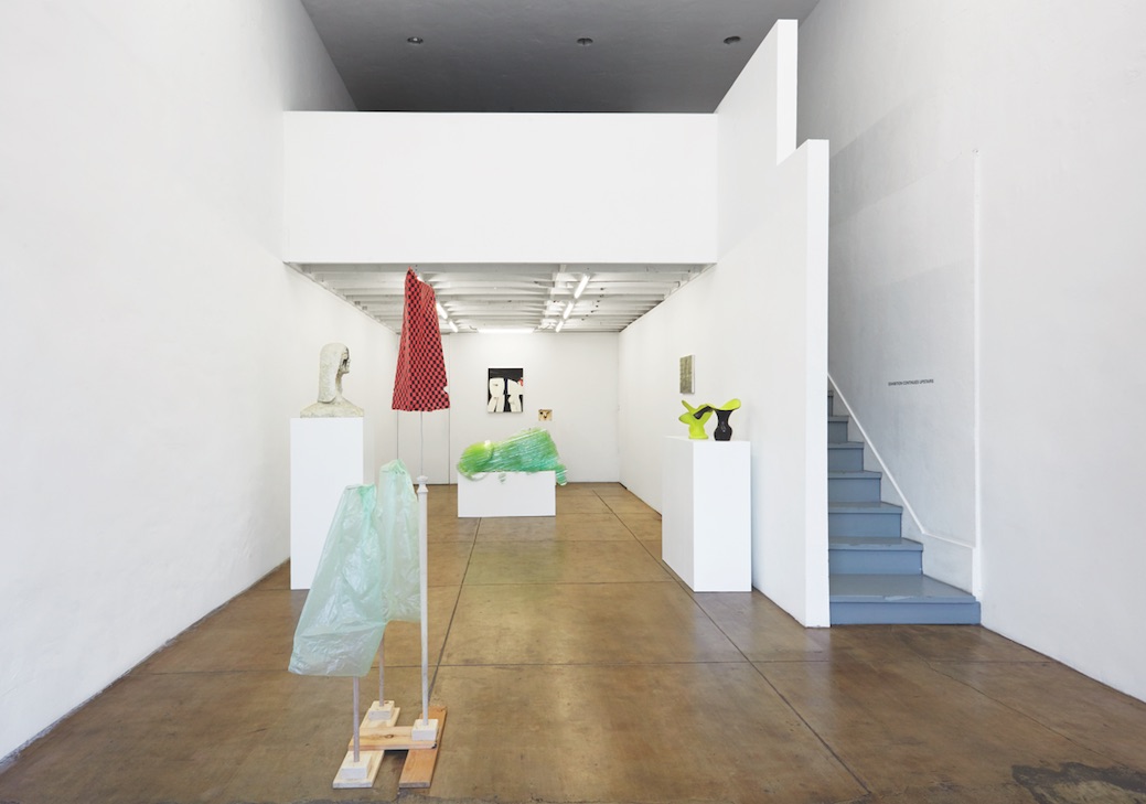
Kate Costello’s Tattooed Lady echoes Stark’s occupation with materiality, graphic simplicity, and femininity. The Lady is a bust at eye level, made from the same gritty white paper and cement mixture that characterizes many of Costello’s sculptural contributions, which usually render female body parts. As with biology, the symmetry is implied but not perfect, and any semblance to actual human proportions ends below the Lady’s head, which sits atop a precariously small, serpentine neck. On her face are two vaguely floral black designs, dropping from her forehead and between her eyes, flaring out to frame her nose and mouth. The Tattooed Lady is defiant, eschewing any assumption of the fully-tatted circus performer that is a hybrid of freakery, pop art, and aesthetic object. The lines of “Lydia the Tattooed Lady” come to mind, a song Groucho Marx debuted in the 1939 film At The Circus: “She has eyes that folks adore so, / and a torso even more so. Lydia, oh Lydia, that encyclopedia.” Costello’s Lady is Lydia’s antithesis, with eyes that are open but inscrutable, no torso to speak of, and an overt absence of inscribed, legible information meant for public consumption. These qualities are given further depth one considers the context created by Costello’s body of work, which includes painting, photography, and sculpture. This multidisciplinary portfolio brings into question the relationships between the nude female body, the blank canvas, and the gaze. Tattooed Lady emerges as a sort of anomaly within Costello’s oeuvre, a transgression amidst her usual pairing of “blank” sculptural bodies, fabricated or human, and her large-scale pattern paintings.
Meanwhile, B. Wurtz’s, Untitled sculpture stands nearby, its three plastic bags rustling faintly and daring anybody to touch their ordinary bodies. The sculpture is a tower, three mundane-as-mundane-can-be plastic bags held aloft by unfinished wooden dowels — a faintly Calvaric tableaux that is also a human form — a square checkered bag whose handle stands in for a mouth, with two lower arms, nebulous and green. The work feels a bit like a test, prodding the boundaries of familiarity and maybe even cheekily jibing the viewers as it offers forth its bags for a reconsideration that mainly falls on their shoulders. This reconsideration may make the action of putting a plastic bag over a stick seem more and more satisfying. Wurtz has been compared to Richard Tuttle, an artist of controversial significance in the annals of recent American art history, and it’s accurate that Wurtz’s sculptural works bear resemblance to Tuttle’s so-called “Systems” in their modest materials and straightforward construction. It is this work that perhaps most obviously represents Paweski’s rumination on the esoteric line between pure studio exercise and finished product, raw as it appears, with simplicity and playfulness reminiscent of Calder and with the alchemic sensibility of Noah Purifoy — two artists, incidentally, whose work has recently passed through LACMA’s expansive halls.
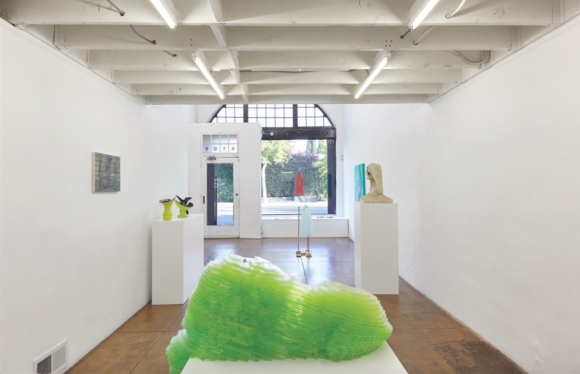
Presiding over the scene is a whimsically green lion, roughly shaped in layers of multi-wall polycarbonate slanted at a neat angle, as if an earthquake subverted stratified layers of sediment on another planet. This is Matthew Darbyshire’s CAPTCHA No. 32 - Sleeping Lion. When Darbyshire was asked to create work for Turin’s Galleria d’Arte Moderna that interpreted the museum’s collection, he identified four frequently invoked sculptural symbols represented by four actual sculptures, which he then reinvented as white styrofoam objects for the exhibition Ideal Standard Forms. One of these chosen sculptures was Leone, completed by Guiseppi Gaggini in 1840, which to Darbyshire embodied the abstract notion of heraldry in the language of sculptural cliché. Since the lion’s 2013 entrance into Darbyshire’s lexicon, it has now been upgraded to CAPTCHA status, reconstructed in brilliantly hued plastic that appears at once pixelated and smooth. The whole damn thing looks as though it walked out of a 3D printer and stopped into the gallery for a (heraldic) nap. Therein lies Darbyshire’s catch: his CAPTCHAs are painstakingly cut, colored, and assembled by hand despite their industrial appearance. For those of us who may have forgotten, CAPTCHA is an acronym for Completely Automated Public Turing test to tell Computers and Humans Apart. Prior to fabrication, Darbyshire does use the computer to design the panels that comprise each completed work, situating the CAPTCHAs firmly in that delightfully liminal space between man and machine.
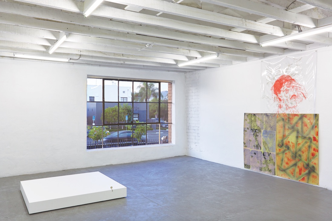
Towards the back, Julie Beaufils’s trois fois toi sits suggestively near an untitled ceramic work by Bruce M. Sherman. The Paris-born artist’s title translates to “three times you” and features a single canvas split into four panels, three of which are filled with the fragmented nether regions of a figure or figures with plural sex organs. For the sake of clarity: three vaginas, three penises, and three butts are included in the work. The fourth panel frames a blank face whose hair rays out across the entire top of the canvas and its vignettes. Here, Beaufils uses her mild brand of disorientation to confront her viewer with the ambiguity of sexual identity, disrupting the potency of genitalia as symbol by multiplying it with cartoon-like brevity. The painting feels timely, its split-screens and symbolic shorthand united under the sort of angst that hits millennials coming and going — at once charged with being entitled, short on attention, and self-involved, there is also a genuine struggle to pluralistically re-define sexual identity on individual and mass scales. The work also seeks to integrate unprecedented fragmentation into the structure of daily life.
With Sherman’s stoneware, Paweski has playfully provided a face where Beaufils has left one out. Slab-built and vessel-like, this figure is all face, albeit one whose expression is a difficult read. There is humor here, with a mouth so small it looks like an afterthought and an iris that dangles from the vesse’'s rim — a sort of organic hardware. Sherman enjoyed his first New York solo exhibition this past spring, which brought together 24 of his character-like sculptures, and it’s hard not to wonder about the rest of this work’s family.
Sherman’s sculpture stands alone, but Paweski has brought forth a group of three works by the late French design stalwart Pol Chambost. The vases, two “corsage” and one “corolle” model, appear perpetually in motion — freeze frames of a formation that is still taking shape. The black and chartreuse glaze is radically split between the interior and exterior of each vessel, giving an appearance of two-dimensionality from a certain viewpoint. Chambost’s work acts to compliment Darbyshire’s Sleeping Lion not only in loud color scheme, but also in offering the utter precision of production goods while remaining handmade. The vessels’ asymmetrical, unpredictable curves are exuberant, both botanical and body-like, shining light on the bizarre contours of human notions of perfection — a handmade vase so smooth as to appear industrial is remarkable, unabashed asymmetry can be sumptuous in objects and plants, but not so much in humans. Indeed, it was in pursuit of a very particular ideal of physical beauty that calisthenics were developed in the first place.
Nancy De Holl’s relatively demure painting features three grouped abstract figures, perhaps a type of foil to Chambost’s resolutely singular objects that, despite being together, need no real accompaniment. De Holl’s objects are entangled in an umbilical network of rogue connections, like plants that find each other and grow together, any real sense of intent lost to human understanding.
Upstairs in the mezzanine, Steven Baldi’s Fujifilm green extrusion (Thomas Duncan Gallery South Wall L2) is a monolithic greeting in green. Constructed with book cloth stretched over aluminum and wood, this new work can be interpreted as an extension of the Black box of Baldi’s 2014 solo exhibition at Thomas Duncan, Branded Light. Black box was comprised of six irregularly boxy monochromes hung on the gallery’s first floor, made from black book cloth stretched between aluminum framing. Upon further inspection of the shapes and titles, they revealed themselves to correspond to the walls of the gallery, invoking a sort of closed circuit between the gallery as white box and Baldi himself. The non-existent imagery of Black box stood to counter Baldi’s second-floor installation, a series of seven in-camera manipulated gelatin silver prints, each featuring a warped brand name. With Fujifilm green extrusion, Baldi seems engaged in attempting to unite his guiding interests of architecture and photography apparatus, bringing the idea behind Black box into three imposing dimensions — now in living color.
What Baldi’s work may lack in warmth, Lily Ludlow’s Bird offers in earthly geometry. The figure is part Art Deco and part Cubist flight. It is in keeping with Ludlow’s tradition of vaguely rendered feminine forms, but in a darker palette. At once a human body tentatively taking to the sky and a face with eyes heavenward, this is a painting of longing. Its subject struggles to defy its trappings even as it cannot escape the inevitable trace of its creation, murky colors and irregular textures, faint stabs at light.
Much closer to the ground, Camille Blatrix’s She perches on the edge of an exaggeratedly squat pedestal, threatening to slink, or leap, out of the frame entirely. She is made from silver and synthetic ivory, with a body like a key, her face of sorts devoid of expression and fashioned with a similar sense as Sherman’s untitled vessel below. If it’s not out of line to suggest the sculpture’s resemblance to a key, it is also worth mentioning the use of this imagery in a recent work on view in Puddle, pothole, portal this past winter at Queens’s SculptureCenter: a singing mailbox that requires the viewer to find a key to read an important letter. The situation is precarious and the materials cold, but it is hard to not feel tender, human feelings towards Blatrix’s sculpture and to wonder what precisely has cast it (her) to the outer edges of its plane. The magic, then, is Blatrix’s ability to imbue this miniature with the capacity to unlock a deluge of sentiment, of edge-time remembrances, and nosy but genuine questions about where She is going.
Three multi-layered works combine in one entity by Camilla Wills, perhaps the most irreverent contribution to Calisthenics. This work by the London-based artist has a distinct Los Angeles feel. The urban connotations of aerosol and chainlink fence blending with a decapitated skeleton and some square, cartoon gentleman expressing his exhaustion amidst strands of hay frozen behind plastic. There are traces of block printing and the suggestion of blood with thumbprint-like marks dotting off the page. There’s a lot going on here.
¤
“How much room can objects take up?” is a question that hovers about Calisthenics, and not only because this is the world of contemporary art. Paweski’s curatorial statement presents the works as sensitive ones particularly suited for representing that slippery — to say the least — space between the artist exercising in their studio and the artist asserting themselves with a finished object. For the most part, the works here overtly allude to either the human body or motion of some variety, varying substantially in their ability to bring the viewer into a fuzzy, family-of-man fold. The calisthenics that take place are then, in part, those exercises put upon the viewer to imagine the artist as human — a body driven by its own logic through an invisible regimen — the results of which, in ideal circumstances, are the perfect balance of strength and beauty.
¤
Rachel Elizabeth Jones writes from the intersections of art, visual culture, and anthropology.
LARB Contributor
Rachel Elizabeth Jones is an artist and writer based in Los Angeles. She is co-editor of Tele- magazine, and runs the art and project space Flower Head from her garage. Here website is rachelelizabethjones.com.
LARB Staff Recommendations
The Writer Postponed: Barthes at the BnF
Barthes at the BNF: the museum presents a panorama of his work.
Sunshine and Noir: The Architecture of Peter Zumthor and the New Los Angeles County Museum of Art
Why Zumthor is the right architect for the new LACMA.
Did you know LARB is a reader-supported nonprofit?
LARB publishes daily without a paywall as part of our mission to make rigorous, incisive, and engaging writing on every aspect of literature, culture, and the arts freely accessible to the public. Help us continue this work with your tax-deductible donation today!