Acts of Re-covery: Mining Our Comic Subconscious
R. Sikoryak on his new book, "The Unquotable Trump."
By Brad PragerDecember 30, 2017
ROBERT SIKORYAK’S REMARKABLE SKILL often goes unappreciated because of its subtlety. His works are acts of cultural appropriation that deftly mine our comic book memories, filtering history and literature through our understanding of comic book history. His art enables our collective, illustrated past to mediate the present. What do we learn, for example, about the culture that produced iconic figures such as Mary Worth and Rex Morgan, M.D., when these two characters reappear as Shakespeare’s Macbeth and Lady Macbeth? If we, as a culture, haven’t yet come to terms with the extent of the sorrows expressed in Charles Schulz’s many decades of pathos-laden Peanuts strips, Sikoryak reassembles the ideological pieces for us, rendering Kafka’s The Metamorphosis in Schulz’s style and retitling it: “Good ol’ Gregor Brown.” Both of these strips, like all of Sikoryak’s work, demonstrate his keen eye and extraordinary finesse.
Sikoryak, born in 1964, generally signs his name “R. Sikoryak.” He has drawn cover art for The New Yorker, LA Weekly, and The Nation. His work has been featured in Wired magazine as well as in the groundbreaking publication Raw, where he worked together with Art Spiegelman and Françoise Mouly shortly after graduating from the Parsons School of Design in the late 1980s. In 2009 Sikoryak published his 64-page hardcover collection of literary works reimagined as classic comics Masterpiece Comics, and his Terms and Conditions: The Graphic Novel (2017) — an inspired take on the unreasonable language of user license agreements — was reviewed six months ago in LARB. He currently lives in New York and teaches illustration at Parsons.
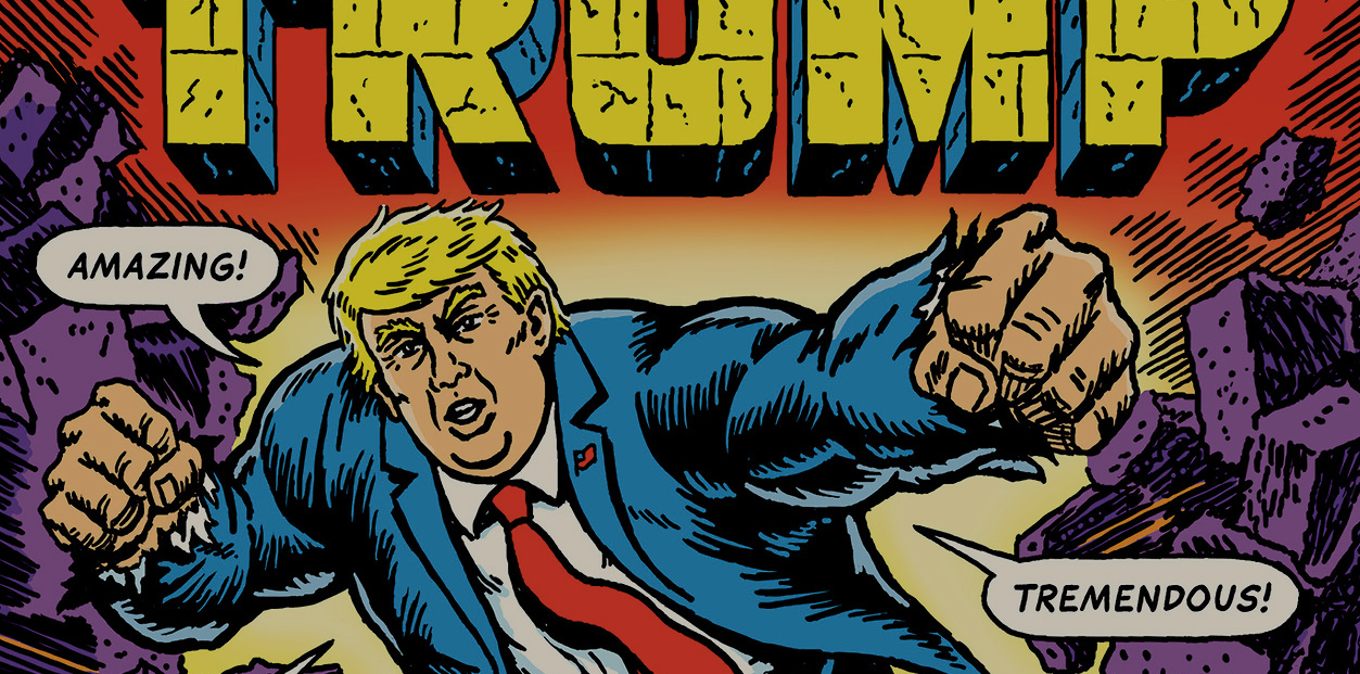
I interviewed Sikoryak about Masterpiece Comics and about his recently published book, The Unquotable Trump. The Unquotable Trump is a collection of iconic comic book covers from many decades that have been remastered to show first Candidate Trump, and then President Trump, taking over the respective comic book’s worlds. Sikoryak’s Trump goes head-to-head with the comic world’s most iconic characters, including Neal Adams’s Superman, John Romita’s Spider-Man, and even Warren Kremer’s Richie Rich. For the book, Sikoryak relied only on direct quotes — as its cover boasts, it consists of “Trump in his very own ‘best words!’”
¤
BRAD PRAGER: On several pages of The Unquotable Trump, Trump is seen speaking even when there is no speech in the originals. For example, the cover of your book is based on a cover of the 1975 Marvel Treasury Edition featuring the Incredible Hulk. On that cover, the Hulk is silent, but your “Hulk-Trump” is uttering a number of standard Trumpisms (“Tremendous!,” “Huge!”). A similar change is noticeable on your “Nice Nurse” cover as well, which is based on an issue of Night Nurse from 1973. In the original, the Night Nurse character is actually speaking, defending her patient by saying, “To kill him — you have to shoot me first!!” In your version, we only hear from Trump, while the comic’s heroine is speechless.

As I conceived the book, I felt it was important to only go by what Trump said. The book is obviously critical of him, but within that context, yes, he’s the only one who actually gets to speak. I conceived of the book right before the election. I had seen a series of mini-comics published by someone I don’t know, a series called “Tea Party Comix” consisting of old comics in which Obama had been inserted as the villain. I came upon them through Ethan Persoff’s site, where he posts a lot of obscure comics. My approach is quite different from those. I really wanted the whole world depicted in these covers to be infected by Trump. Even the titles of the books that he’s in have been tailored to fit his perspective. Sometimes the titles are more neutral, like “Subjective Comics,” based on Detective Comics, but on other ones, like the Wonder Woman cover in which she’s not Wonder Woman, but “Nasty Woman,” Trump’s language becomes part of the world that the characters inhabit. These characters do have a voice — they have personalities, and they have humanity — but as far as this book is concerned, everything is shaped by Trump’s perspective, and he drowns out everyone else.
The cover that is most striking for me, and which is most suffused with Trump’s perspective, is Pap Comics, featuring “Archy,” which is based on an issue of Pep Comics from 1952. If you look at the original cover, Archie is as happy as can be. His face is covered in lipstick from Veronica’s kisses. In your version, he is truly miserable. Even in the book’s marketing icon, in the upper right, poor “Archy” is suddenly suffering, wondering how all this has happened. The world has been invaded, much to the chagrin of the characters we know and with whom we identify. This is Pop’s soda shop, and Trump, as Pop, is running the show. Elsewhere, of course, you have him appear as Solomon Grundy or the Red Skull.

I was always trying to find a dynamic where, if Trump wasn’t a villain, he was at least a counterpoint to the main character. He takes the place of Tubby in Little Lulu, for example. Tubby is hardly a super villain but sometimes he’s a pretty bratty kid, so there the equation sort of works.
Several of these covers read differently from the others, including two that I would describe as feminist fantasy inversions: the pairing of the Catwoman cover alongside the one George Perez did of Black Widow from a 1983 Marvel Fanfare. Those covers depict worlds in which the women are in the dominant positions. Black Widow is really carrying the day in the your version of the cover, so the book varies its perspective in that regard, even if Trump comes out on top most of the time.
Those two covers just ended up next to each other. The book is for the most part ordered chronologically. There are one or two pages where I had to shift things around. I really didn’t want to start the book with his famous quote about Mexicans, so I put his quote about building the Wall first. The two were said within the same day, so that’s not such a big change. I tried to follow the campaign’s chronology, but that led to some of the covers echoing one another in odd ways. The two you mention evolved out of the debates.
Some of the covers you’ve chosen seemed as though they were pulled directly out of my own memory bank. I remember collecting some of the Neal Adams and George Perez covers at the time of their appearances, although I had stopped collecting comics by the time the issue of 300 you cite came out in 1998. Your work mines different areas of the adult, nostalgic unconscious. Was there a principle of selection? How did you go back through your conscious and your less conscious memories, deciding what to draw?
I’m sure a lot of the choices are directly attributable to what I was collecting and what I grew up with, but I really didn’t want the book to represent only my perspective. That’s true of Terms and Conditions as well. I was trying to run the gamut of styles and to put things in the book that people who didn’t grow up in the 1970s would also remember and relate to. Because of the movie, 300 was a major pop cultural moment. It made such an impression that I thought it was worth mentioning here. I didn’t want to suggest that the concerns raised in this book apply only to, say, white men who collected comics and who are now in their 50s, but rather to suggest that these concerns apply to most everybody. Although it was easy to choose superheroes, I tried to find other ways of integrating Trump.
The cover based on an issue of Adventure Time no. 5 really torments those Adventure Time characters. On the original cover, they’re not crying. In your version, it looks as though you’ve caught them on the most miserable day they’ve ever had.
It would have been harder to do these if I had really adhered to the rules that I had first thought of when I started. But changing their expressions seemed like a minor thing.
Some of the covers resonate more strongly than others. The defeat of Superman resonates in a particular way, and here I’m thinking about the 1971 Justice League cover, the one based on the original by Neal Adams and Dick Giordano. Turning Superman into “Supersad” was an inspired take, but there’s a way in which destroying Superman is part of the fantasy that our political rhetoric plays into. It’s a horrible thing to watch, when Superman goes limp like that. Another Superman cover later that struck me similarly was the one for “World’s Failest,” based on a cover for World’s Finest on which Superman looks distraught and helpless.
That is his original pose. I didn’t have to change that one. Trump speaks a lot about good and evil and about what’s right and what’s traditional, and about what represents “our country.” The terms wouldn’t be out of place in some of the older DC comic books. But then, you see him in opposition to these characters, and I think it’s evident that he’s coming from a different place. His perspective is not the same perspective that Batman or Superman had on those issues. The gamut is pretty wide here, but the more traditional superheroes tend to resonate a lot — they’re bigger than we are.
The mediation in this project works on a number of different levels. Our collective memories are being overrun, but this is exactly what a lot of political rhetoric aspires to. Comparisons with the Red Skull plug into our worst fantasies.
There was an early Fantastic Four villain called the “Hate-Monger,” who first appeared in 1963 and was driving people crazy by instilling hate in everyone, but the cover featuring him wasn’t iconic enough. It didn’t lend itself to a specific quote, but it seemed very on the nose. Some things are built into these characters.
And a lot of what was shocking during the campaign has become normalized.
Occasionally I get feedback from someone who doesn’t know why I’m being so mean about Trump, and there are some people who don’t see him as speaking out against anyone who doesn’t have it coming. But any good villain in a movie or a comic book has a very good reason for doing what they are doing. Even Doctor Doom thinks he’s doing the right thing, so it’s really hard to know how to unpack all of this.
It’s fascinating to me how your work has so many different historical layers, which distinguishes it from a lot of similar projects. I was thinking, for example, about Alan Moore’s Supreme, which I enjoy, but in those he is mediating comics through comics. He takes the history of the traditional superhero — whether it’s Superman or Captain Marvel — and filters it through a contemporary comic book lens. That’s an interesting exercise, but what you’re doing adds an additional dimension. The Unquotable Trump works from the collective memory of our youths, as does Masterpiece Comics, in which you are mediating literature, and really history itself, through comics. That produces a kind of triangulation: the Genesis story in the Bible as seen through the figures of Blondie and Dagwood, for example, and our reception of Blondie and Dagwood entering into it as a third element. I have to ask myself, when I read Blondie, why am I still looking at this fantasy from …
... the 1930s.
Right, it’s Chic Young’s idea about what domesticity is meant to be like. Filtering the Bible through that is a fascinating exercise. As you move through literary history and the comics, how do you pair these things?
The first book I adapted was Dante’s Inferno. I think I was playing more with form than with the characterization when I combined it with Bazooka Joe bubble gum comics. I was taking the loftiest, most seriously reverential epic poem and combining it with the most disposable comic there is. But then the next one I did was “Good ol’ Gregor Brown,” and that was where I thought that there seemed to be an analogy between the personalities of Charlie Brown and Gregor Samsa. When I started putting all of it together, the parallels really came into focus. I put Kafka’s dialogue into the mouth of the Charlie Brown bug, and I saw that there was no space between these characters. I didn’t have to fudge the dialogue to make it fit Charlie Brown, other than to add a “Good Grief!” Kafka was speaking for Schulz, or vice versa, and that was really exciting. Beyond that, I felt like I was paying more and more attention to how the characters related to the stories or even maybe how the genres related.
Making Wuthering Heights into a 1950s horror comic was hardly a stretch, and I don’t know if it was enough of a stretch to get the kind of jolt that I am usually looking for. But the way that novel is generally treated and thought of is much milder than the novel actually is, so I had to think of a really brutal comic to combine the novel with. I think about how things might connect and I make notes. Sometimes nothing comes of them, but sometimes something really seems like the right idea and I pursue it. What’s fun about doing these, and what has become important sometimes, is thinking about how the stories are told. I’m currently working on a sequel to Masterpiece Comics, and one of the new stories appeared in the Graphic Canon of Children’s Literature (2014). It’s a version of Tom Sawyer in the style of one of these Family Circus maps, and it actually tells the whole story as he moves through the neighborhood, to the island, to the courthouse and then to the cave. In that case I was playing with the wholesome kids of Family Circus set against Mark Twain’s more shaded views of youth. I had been asking myself, “How can I take this structure and use it to tell the story?” So, it happens in different ways. People have suggested ideas to me for other strips, and I could see how they would work. If they don’t resonate with me I won’t do them, but it all seems valid to me, and there are many ways to approach it.
It almost gets lost that you’re also offering a literary reading of a text, whether it’s of Marlowe or Brontë or any other author. It shouldn’t go unremarked that you’re a good close reader of literature. When it comes to “Inferno Joe,” I notice that you only picked Inferno. There’s no Purgatorio or Paradiso. There’s only “Inferno Joe.”
That strip was done for Raw Magazine in 1989. I only had one page, and at that point I’d only read Inferno. I thought about going back to finish the trilogy. I like closure and I considered it, but they don’t even make Bazooka Joe comics anymore. They changed the format, which is heartbreaking to me for a couple of reasons. I don’t know if that would resonate, but I considered following Joe through the other realms. It was more a question of space. Inferno is a satisfying read on its own, and many people don’t read the other two.
Raw’s aesthetics may also have helped determine that there would be only Inferno. But in any case the journey to Hell brings out something about the strange world that these figures inhabit: Bazooka Joe himself has an eye patch, which is a difficult fate for a teenager — however that might have happened — and his friend, Mort, has this oddly placed turtleneck, which turns him into Joe’s mouthless guide through Hell.
Looking at “Blond Eve,” your take on the Genesis story — your decision to turn Mr. Dithers into God was inspired. This meddling boss is walking around ruining everything for Blondie and Dagwood’s Adam and Eve. They seemed to have it good, and then their exile becomes the world of Chic Young’s comic. You’ve given us an origin story. This could be the very first Blondie. It tells us how they got into that house in the first place. They were exiled from Heaven, and now nothing remains but our cruel laughter over their fates.
Sometimes when I do these strips I end up killing the characters. Batman only goes to jail in “Dostoyevsky Comics.” But the Blondie one was striking. I was thinking it through, and I thought, “Oh, that’s were they would end up.” It’s not the end, but the beginning.
I noticed that you drew a sendup of The Lockhorns in which Mr. Lockhorn is explaining the stakes of the Vietnam War to Mrs. Lockhorn. His particular kind of sadistic masculinity is what anyone who enjoys The Lockhorns finds funny. He’s saying to her, “If Vietnam falls, all of Asia goes red, you stupid cow.” The Lockhorns first appeared in 1968, and repositioning him in this way, within that historical moment, is right on the money.
That was a drawing I did for The Daily Show. It was a commissioned illustration for them, and I think it was in response to the Muhammad cartoons in the Danish newspaper. It was written by The Daily Show’s staff, some of whom are big comics fans. They were excited that they could get a Lockhorns reference on the show.
You also made me aware of “Apocalypse Pooh.”
I came across that around 1990 when I was working at Raw. It was on VHS, and I’m not sure how it was edited, but it’s well done. It was great working at Raw, and a lot of good stuff just came over the transom. I was lucky to be there, for a number of reasons. It’s amazing to me that I had that opportunity.
Lately I’ve embraced digital comics, in part because I don’t have room for real comics anymore. It’s partially a question of space, and it’s partially about access. I did a Wonder Woman parody a couple of years ago — a retelling of the Marquis de Sade’s Justine as 1940s Wonder Woman covers, which was reprinted in Best American Comics 2015. In order to do this, I tried to look at all the 1940s Wonder Woman covers. Thankfully, those have been scanned, so you can track that stuff down. I don’t know if all of it has been reprinted. I like seeing the original colors, and a lot of the reprints take liberties. It’s really helpful in terms of research to be able to work that way, to work digitally.
Are there artists whose work you wouldn’t remediate? As I read Masterpiece Comics, I asked myself, “Where’s Hergé?” But then, of course, on your website I see that you indeed remediated Tintin in 2001. Would you ever say, “That’s something I wouldn’t tackle”? Where do you draw your lines?
That’s a complicated question. Part of the reason I did the Terms and Conditions book was to address comics I hadn’t gotten to in other ways. When I began the Masterpiece Comics project, I hadn’t thought about international comics, and part of the joke about Masterpiece Comics was that these were American comics steamrolling great works of world literature. I know Tintin pretty well, but I know American comics better. I just don’t know some great European or Asian comics in the same way. Part of it is being comfortable enough and confident enough with the source material to be able to do a good parody of it. The Tintin piece was written and drawn for Wired magazine. They came to me with the assignment to do a strip featuring Tintin going to Mars, and they gave me all the research about what might go wrong. The idea was that I was supposed to catalog it, which is kind of like what Hergé would have done. He would have tried to get the science right. I only had a page, so I didn’t have to work too hard, but I tried to be faithful to Hergé’s approach.
The Terms and Conditions book was a way to touch on cartoonists from different countries as a way of showing that I was paying attention. For Masterpiece Comics, it makes sense conceptually that it’s all American comics. I need some constraints, because otherwise I’d probably go insane. The Japanese manga artist Osamu Tezuka, by the way, did a version of Crime and Punishment with a little boy who looks sort of like Astro Boy, but it’s a fairly straightforward retelling of Crime and Punishment. Other countries’ approach to comics and literature is different from mine, or at least from what I grew up with, so it might make more sense for me to stick with American sources, because I’m responding to that heritage specifically.
That’s a level of mediation I hadn’t thought about. Masterpiece Comics is primarily European literature seen through a 20th-century American lens. In another interview you mentioned a Russian reader of Crime and Punishment who was irritated by your take on the story.
I was sort of amused by that. I don’t like it when people go away angry, but I am a trickster on some level, so I understand why I upset people. When I started the project I thought I was goofing on bad adaptations in comics and I also thought I was goofing on the high and low culture divide. But neither of those things exist the same way anymore. Many librarians have embraced comics wholeheartedly, and many teachers have said to me, “I show your comic to my high school students.” I wonder whether they really want to show them my Batman version before they actually read Crime and Punishment. It’s likely to color their reading of the novel, even though I do try to take the literary sources sincerely.
I’d be interested in your relationship to the word “adaptation.” There’s nothing more disappointing than when you open a graphic adaptation — a graphic novel based on a novel — and it’s really nothing more than an adaptation. Do you use that word to describe what you’re doing?
I like the word adaptation, but I sometimes call what I do “translation.” I’m being a little facetious with both of those terms. I try to remain faithful to the source text, and I try to remain faithful to the comic source, but the point is that they don’t really belong together. So the humor, or the disjunction, comes from that fact. Sometimes I get frustrated with adaptations that take too many liberties, but if they’re too faithful, they just die. It’s hard to find a balance, and I think I’ve tried to find a way around that by sticking to the plot. It may feature Little Lulu, as in my “Little Pearl,” or someone else that doesn’t belong there, but the plot remains that of the book being adapted. If you want to follow a plot line, my work might be more accurate than some of the Classics Illustrated, which I was also making fun of. Those present themselves as sturdy texts and wholesome for children, but they’re pretty boring.
There’s a lack of fun in those.
They might have been useful for writing a book report, and so many people have said that about them. I don’t think I would have taken the time with them as a kid, even if I had seen more of them. They were out of business by 1971, and I never paid much attention to them. They were really turgid, and they became more earnest as they went along. The earlier versions in the 1940s at least had some manic energy from the artists trying to finish in time for the deadline. By the later ones, they just seemed really stately and, yes, really square.
¤
LARB Contributor
Brad Prager is professor of Film Studies and German Studies at the University of Missouri. He is the author of After the Fact: The Holocaust in Twenty-First Century Documentary Film and serves on the Editorial Advisory Board of New German Critique.
LARB Staff Recommendations
Creating a Comics Canon
Russ Kick’s "The Graphic Canon of Crime and Mystery" is, for now, the most sustained anthology of comic art in the English language.
Redefining Jewish Authenticity: An Interview with Eli Valley
Nathan Goldman speaks with Eli Valley about Trump, Kafka, the John Podhoretzes of the world, and "Diaspora Boy: Comics on Crisis in America and...
Did you know LARB is a reader-supported nonprofit?
LARB publishes daily without a paywall as part of our mission to make rigorous, incisive, and engaging writing on every aspect of literature, culture, and the arts freely accessible to the public. Help us continue this work with your tax-deductible donation today!